|
2/17/2021 0 Comments Text analysis practice questionWHAT SIGNIFICANCE DOES THE CONTINUING DEVELOPMENT OF DIGITAL MEDIA TECHNOLOGY HAVE FOR MEDIA INSTITUTIONS AND AUDIENCES?The continuing development of digital media means a lot to audiences and institutions. For starters, this means that media is going to get put out faster, and in better quality. For audiences this is a good thing. It means we can expect higher qualities while also hopefully getting them in bigger quantities. By this I mean getting movies or whatever the product may be, out quicker. For media institutions, it means that they should have an easier way of making their media, however it comes with a minor downfall. Because audiences are expecting a better quality product, institutions can't simply put out the old quality at a faster rate with the new digital media technology. They have to, at the same time, work on improving it so that it can meet the consumers' raising standards.
0 Comments
In order to figure out the language I wanted to use in my article, I used this example article: https://copyblogger.com/how-to-write-a-killer-how-post-that-gets-attention/ . This article was like mine in the sense that it was a "how to." The only difference was that mine wasn't going to be as step-by-step, but rather more conversational. This is because my audience is mainly teen girls, and I want to make sure that the article is fun to read and doesn't lose their interest. Additionally, my language will be formal for the most part however I will include some informalities to ensure that it feels like it was written by someone of my target audience themselves.
2/16/2021 0 Comments Double Page spread DraftThe first thing I did for my double page spread was choose the theme. I wanted something that captured the essence of a teen magazine while still giving me the freedom to make it more mature. I ended up choosing a girls' night. This is because a girls night can apply to any age group, and therefore can be modified to fit any teen or tween. Next I chose my color scheme. originally I had hot pink and teal blue for my words and shapes, however I realized that it didn't stick with my theme of proving that teen magazines don't have to be marketed as childish and girly, so I changed it do a soothing brown and soft pink. 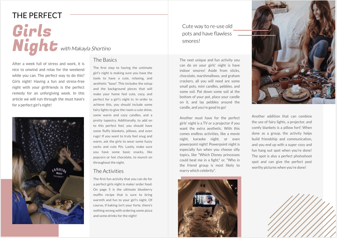 2/11/2021 0 Comments Two page soread: ideasToday I started some planning for my magazine two page spread. Decided that I want to use my "a perfect girl's night" as my article because that is one of the things I am most confident and could accurately write about. I also know that I will be able to fill my pages with a lot of information and images, so I won't be leaving too much blank space. Also, I find that when you google things for a girl's night, most of the results are either for adults or for little children. There is nothing that perfectly encompasses what teenage girls nowadays would consider a perfect girl's night, so I will be the one to provide this for our generation. In order to accurately do this though I will also ask some girls my age in order to make sure the information I write is universal and agreed upon.
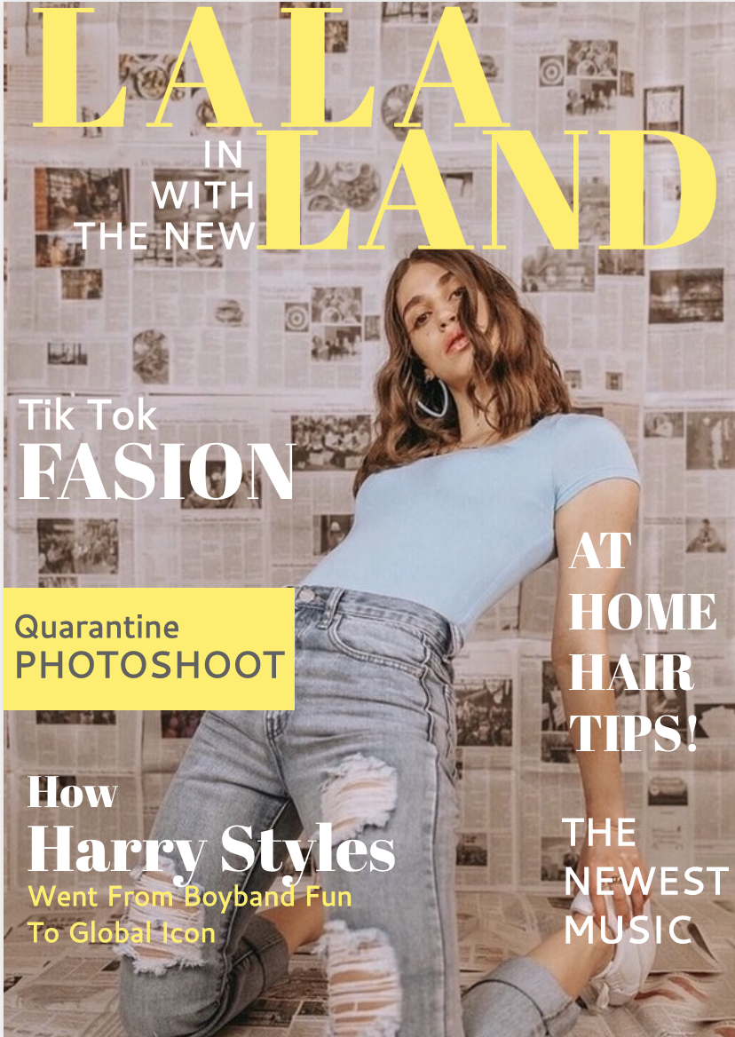
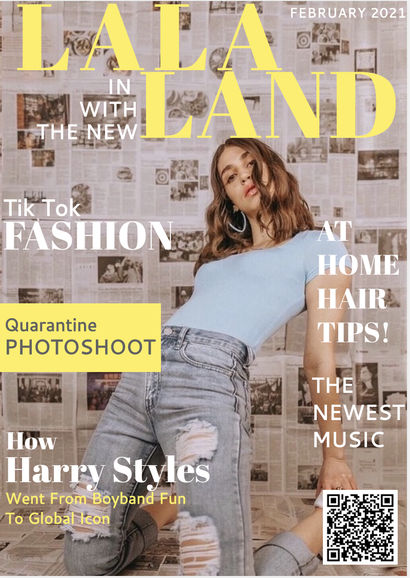
2/10/2021 0 Comments Magazine COver editsAfter letting my magazine cover sit for some time untouched, I went back to revise it and create what will hopefully be my final cover. I reorganized and shifted some of the text slightly, along with adding some key components I was missing, like the edition/date and the barcode. The barcode has become one of my favorite factors of my magazine cover, because rather than putting a dull fake QR code, I linked it up with my blog so that it can be scanned and readers will be taken straight here, where they can see the behind the scenes of its creation. Additionally I fixed a spelling mistake from my draft. The only thing that may end up being changed is some of the article titles, simply because I haven't written them all yet and may end up choosing to change the topics.
In order to integrate technologies into this project, I used new software such as Canva and Flipstack in order to get the look that I needed while using the resources that were readily available to me. For some pages, such as the table of contents, it was easier to use Canva while others were easier on FlipStack, so I integrated and mixed both methods to make the process as simple as possible. Lastly, I used Picsart for some of the photos I included in order to edit them and make them fit the overall mood, vibe, and color scheme of my magazine.
|
AuthorMy name is Makayla Shortino. I'm a junior in high school and enrolled in AICE Media Studies, which is why I have created the website you see here today. Archives
April 2021
Categories |
 RSS Feed
